
Prohibition: The Noble Experiment
My Role: Art Director, Designer, Researcher
After working on this project I now know way more about Prohibition than I ever thought possible. Digging into this period of history was actually mind blowing. So much of our contemporary life was molded by the movement to ban alcohol. Women’s voting rights and income taxes are just a few of the seismic shifts that occurred in relation to Prohibition.
The exhibit is generally part of a larger tour, so I tried to take a two-tiered approach to the layout so a visitor can take a quick look at it and pick up a few memorable facts, or if they have time, stay a little longer to peruse the deeper content and display cases.
All in all, with a lot of other things on my plate, this took about four months from concept to completion. The research taking up a bulk of the time. This is definitely the most challenging and satisfying project I’ve worked on. From sketching layouts in Photoshop to seeing it materialize in real life, it was an incredible experience, plus any day now I’ll be getting my honorary degree in the social and political upheavals of the Prohibition era.

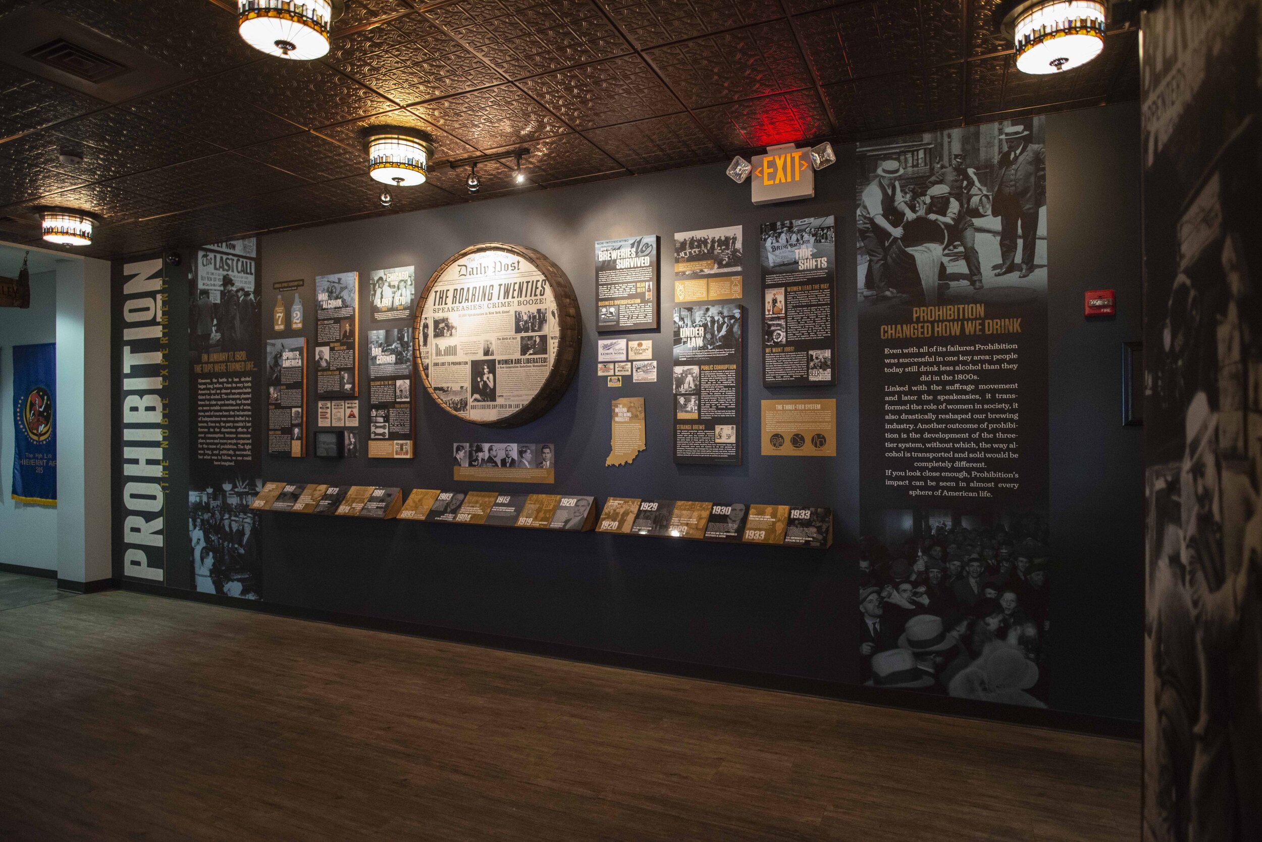
After mocking up a ton of bad journey flows I finally hit on something that worked. I decided to divide it into a before-during-after for the horizontal flow and a specific to general information flow from top to bottom. So, at the bottom I have a basic timeline with highlights that spans the exhibit and above is more in-depth information on the corresponding historical events. Also a few fun facts to call out on a tour, such as the 32,000 speakeasies in New York. To mix up the visuals a little bit I decided to place a barrel display as the centerpiece. I made it look like a newspaper from the twenties. This was the only piece that deviated from the color and type scheme, giving just the right amount variation to maintain visual interest.

Highlight of basic timeline that runs across the bottom portion of the exhibit.

On the headline for the centerpiece I put some placeholder text, “Speakeasies! Crime! Booze!”. After looking at it for a couple days I thought, hey, this actually works. Just the right amount of cheesy retro hyperbole. Sometimes everything just falls into place.


A former coat closet was turned into a “speakeasy”. Complete with a small functioning bar.

Wood burned beer barrel sign hanging over the entrance of the exhibit.