
Coastal Valley Water Rebrand
MY ROLE: Art Director, Designer

This project delved deep into the heart of a brand to rejuvenate its identity and amplify its resonance in the crowded NWI Market. With rebrand I didn’t want to alienate the current customer base, but wanted the brand to feel even more like itself. The renewed visual identity manifested itself across print and digital, as well as wearables and environmental design.
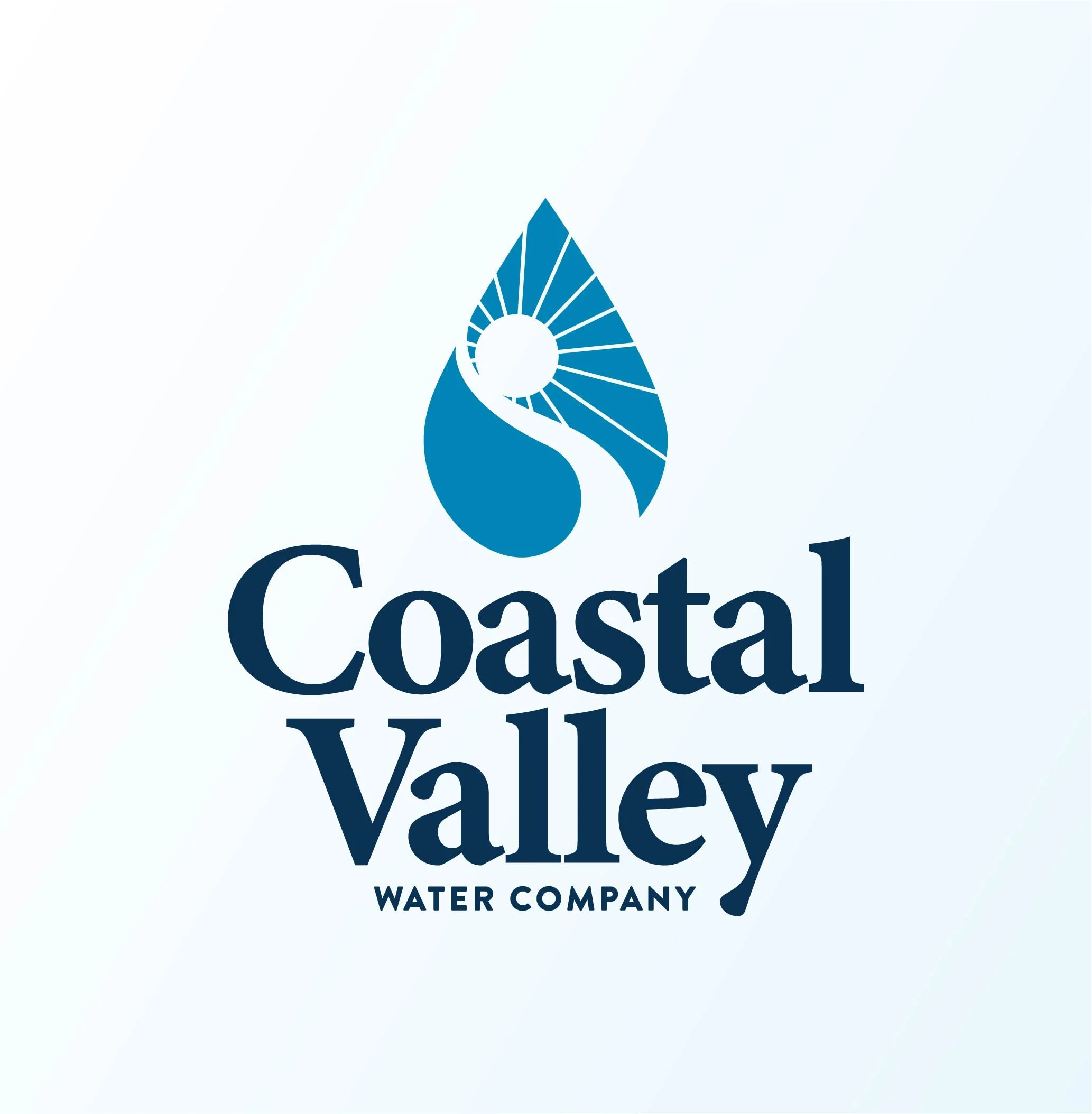
One non-negotiable caveat with the rebrand was that the client wanted a water droplet in the new logo. I took inspiration from the old mark, and using the forms and contours of the droplet, brought them in to the new mark.
After a customer base and market wide audit I determined the best course of action was to again elevate, not eliminate, the serif typeface used for the main mark, while using a sans serif for the secondary typeface, allowing for a balance of approachability and precision.
Before/After
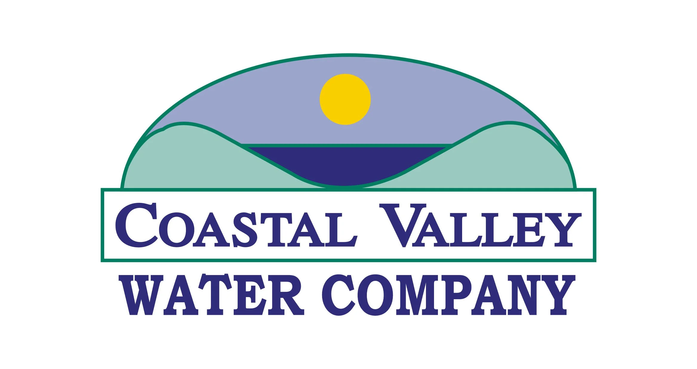
Old logo

New logo
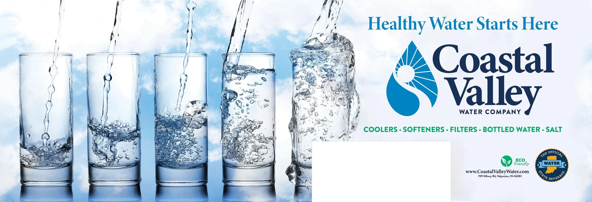
After the mark was approved I pivoted to the color palette, photography styles, and secondary and tertiary expressions of the brand. Below is a round up of some of those artifacts.
How it came to life


Brand artifacts

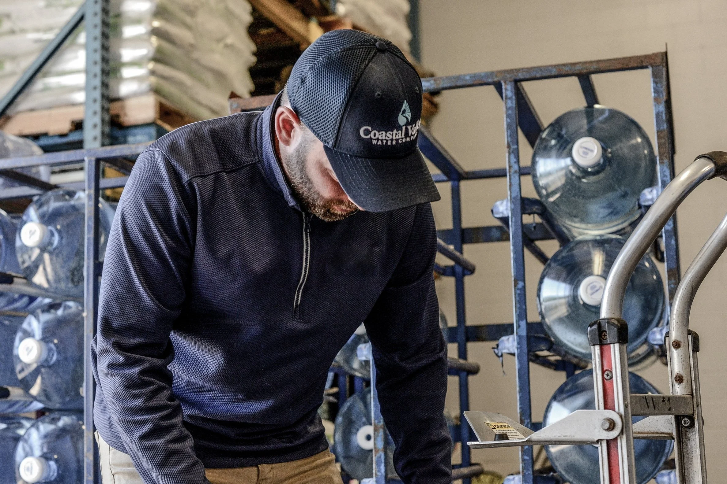

Wearables and photography
Side and back for delivery trucks
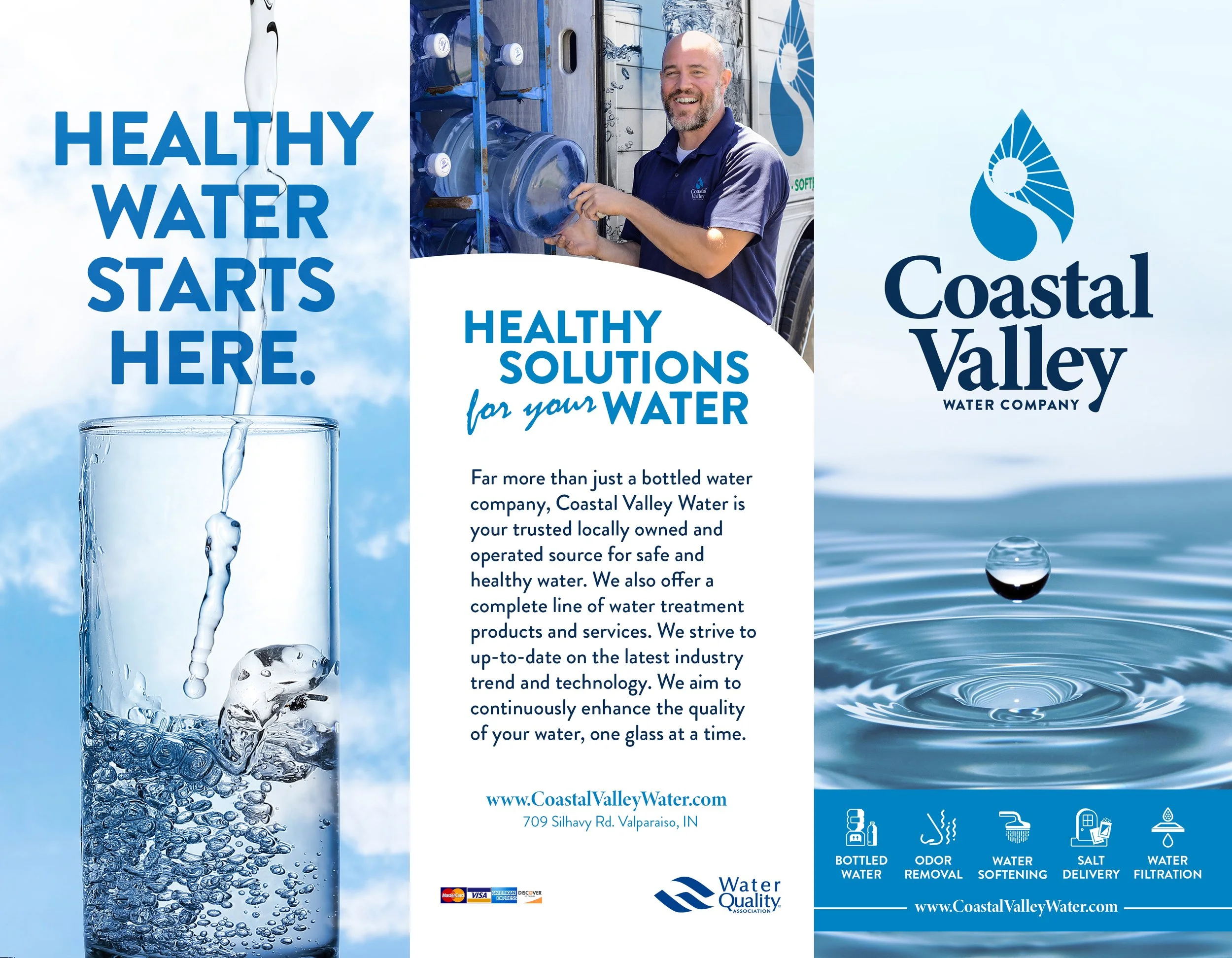
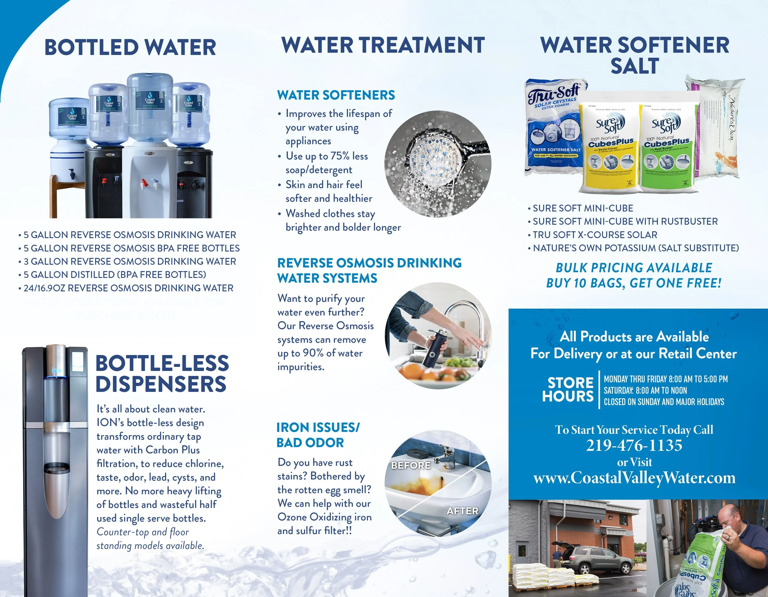
Print brochure

In-store signage